
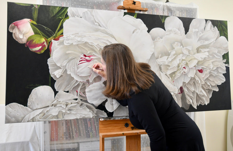
Michael Chesley Johnson shares with us his perspective on color temperature, emphasizing how all representational painters – whether that be landscape, portrait, or still life – will benefit from mastering the use of color temperature contrast as a means for creating the illusion of reality.
Michael works in oil, pastel, and gouache in the American Southwest, coastal Maine, and the Canadian Maritimes.

Why is color temperature important?
Although value contrast alone can be used to depict a sense of light and shadow, color temperature contrast—warm against cool—increases the effect. As a landscape painter, I often find that getting the right temperature contrast goes a long way to enhance the illusion of strong sunlight or, in a diffuse light setting, overcast skies. For portraitists, color temperature can be used to help turn the form. For still-life painters, it can be used to create a sense of distance between objects.
What challenges do painters experience that can be improved when color temperature is addressed?
We might think that creating a shadow color by simply adding black will give the illusion of strong sunlight. But it doesn’t. It actually deadens shadows and lessens the illusion. Regardless of the lighting situation, whether strong or diffused light, there’s actually a lot of color in both cast shadows and form shadows. Paying heed to color temperature contrasts will keep the shadows lively and the painting, more interesting.
For the portraitist who wants to turn form without shifting values, as when the subject is frontally lit with very little shadow, using shifts in color temperature rather than value will do the trick. For the still life painter, using a color temperature shift from warm to cool can help objects appear to recede into space. Imagine painting a picture of a set of green china arranged on a table; as the objects in the set go away from the viewer, making the green increasingly cool will give the sense of the third dimension. The same approach also works for the landscape painter to put distance into the scene.

Michael Chesley Johnson – Cliff Shadows 9×12 – Oil
How do you know when a color is too cool or too warm?
Whether a color is too cool or too warm often depends on the eye of the beholder. Some of us like to “push” color – and thus temperature contrasts – for effect. When I paint the landscape, which has naturally muted colors, I observe the temperature relationships and try to develop a model in my mind that looks real and not garish; but what I put down on canvas might be slightly exaggerated to increase the drama. If it looks like a cartoon, though, I know I’ve gone too far, and I have to dial back the temperature contrast. But other artists, depending on their goals, may prefer an even more exaggerated look.
Example: Applying color temperature
Step 1: Establish values
This is the monochrome painting, 9×12. For this, I used the set of Portland Greys (Light, Medium, Deep) Chromatic Black and Titanium-Zinc White to depict light and shadow on the mountain. Although there is a sense of sunlight, it’s not very convincing.

Step 2: Color adjustment
Next, using Burnt Sienna, Yellow Ochre, Cerulean Blue Hue, Chromatic Black, and Titanium-Zinc White, I applied color to the monochrome painting. To put color into the shadows, I simply darkened the “local color” of the rock (mostly Burnt Sienna) with Chromatic Black and adjusted value with white. The earth colors (Burnt Sienna, Yellow Ochre) are naturally muted, resulting in an overall muted or dull feeling to the scene.

Step 3: Full color
Now for richer color application, which is where our lesson in color temperatures comes in. I decided to strengthen all the colors in both light and shadow areas. I also “pushed” the temperature contrast by putting more blue (Cerulean Blue Hue) and cool red (Permanent Alizarin) in the shadows and, in the lights, more yellow (Hansa Yellow Deep) and more warm red (Napthol Scarlet). Finally, I intensified the color of sunlit snow and clouds with Hansa Yellow Light and Titanium-Zinc White. Using richer color and in a more pronounced temperature contrast resulted in a more dramatic and satisfying picture.

How do you organize your palette with color temperature in mind?
In my workshops, I stress the importance of having an organized palette. But even more so, I stress that the paint is laid out in a logical progression of temperature. It’s much easier to adjust the temperature of color mixtures this way. Is the mixture too warm? If adding more of the cool component doesn’t work, move one color over in the cool direction, and add a bit of that. Is the mixture too cool? If adding more of the warm component doesn’t work, move one color over in the warm direction, and add a little of that.
Without your colors in the proper sequence, you’ll find yourself hunting for the right adjustment color, wasting time, and probably making errors.

The colors can be laid out in either a line or a circle. I lay out mine in a line, starting with yellow on the left. Why? Because I put my white on that side, next to the yellow, and this way there’s less chance for the white to get tainted by a dark color. So, the line starts off with coolish colors (yellows), moves to warm (reds), and ends with cools again (blues). My palette includes two versions of each primary, a warm and a cool, which is also called a split-primary palette.
- Hansa Yellow Light (a cool yellow)
- Hansa Yellow Deep (a warm yellow)
- Napthol Scarlet (a warm red)
- Alizarin Permanent (a cool red)
- Ultramarine Blue (a warm blue)
- Cerulean Blue Hue (a cool blue)
Color thermostat
As I paint, I treat this line more like a circle, mentally joining the cool yellow end to the cool blue end. When I want to adjust the temperature of a color or mixture, I just go around the circle as needed, clockwise or counterclockwise. This circle is, of course, the color wheel. But imagine it as a sort of color thermostat, where you can dial the temperature you need by shifting around the wheel. Below are some examples of this technique in action.

Cooling colors down
Let’s start with a single color, Napthol Scarlet. If I want to make it cooler, I add a little of the color next over in the cool direction or Alizarin Permanent. If I want to make it even cooler, I can move over one more step and add Ultramarine Blue.

Warming colors up
Now let’s look at a mixture of two colors. Here I’ve made a cool green with Cerulean Blue Hue and Hansa Yellow Light. If I want to warm it up, I can add more of the warm component, Hansa Yellow Light. But if I want to push it even more, I can go one more step in the warm direction and add a little Hansa Yellow Deep.

Sometimes this results in a hue shift. If shifting hues is a problem, consider expanding your palette. Gamblin makes a color closer to your desired hue and temperature. They offer a handy list that gives you the properties of each of their colors, including temperature.
The point of keeping your palette organized this way is to make color-mixing quick and intuitive. With a little practice, you’ll stop thinking about how to shift the temperature of your mixtures – and start painting with greater freedom.
If you enjoyed Michael’s writing as much as we did, check out more of his thoughts on his painting blog.
This article was provided by our friends at Gamblin.
Recent Articles
April 15, 2024
Blossoming As An Artist with Sandy Terry

April 12, 2024
The Opus Warehouse Sale 2024
April 05, 2024
Revival of Colour with Opus Essentials Spring Colours
April 02, 2024
How To Refill COPIC Markers
April 01, 2024
Liquitex: Just Imagine 2024
March 28, 2024
Art Events: Art Vancouver 2024
March 23, 2024
An Exploration Update with Cara Bain
March 20, 2024
How To Make A Mixing Chart with Daniel Smith Gouache
March 19, 2024
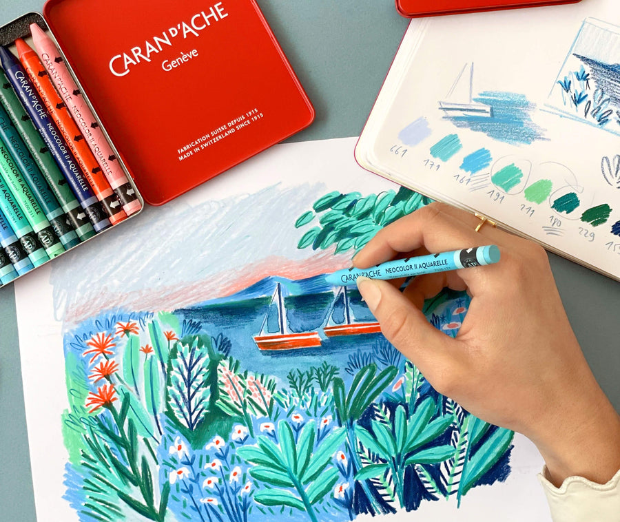
Learn to Draw Like Beya Rebai with Neocolor II
March 13, 2024
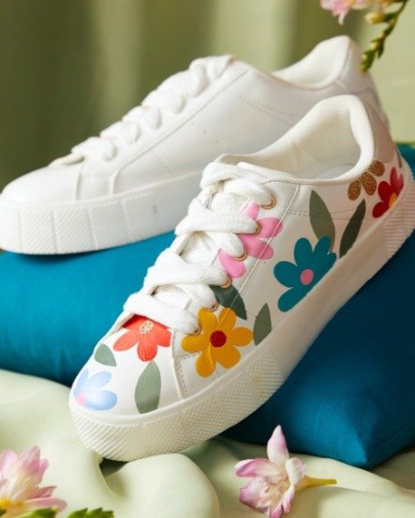
Customize Your Leather Trainers with Floral Motifs
March 13, 2024
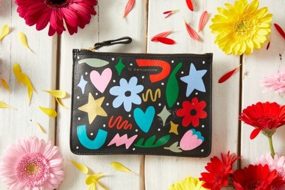
Customize Your Own Leather Pouch
March 13, 2024
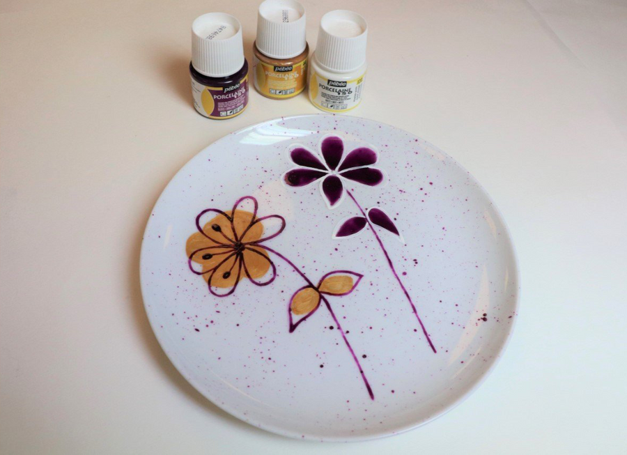
Creating Flowers on a Porcelain Plate
March 11, 2024